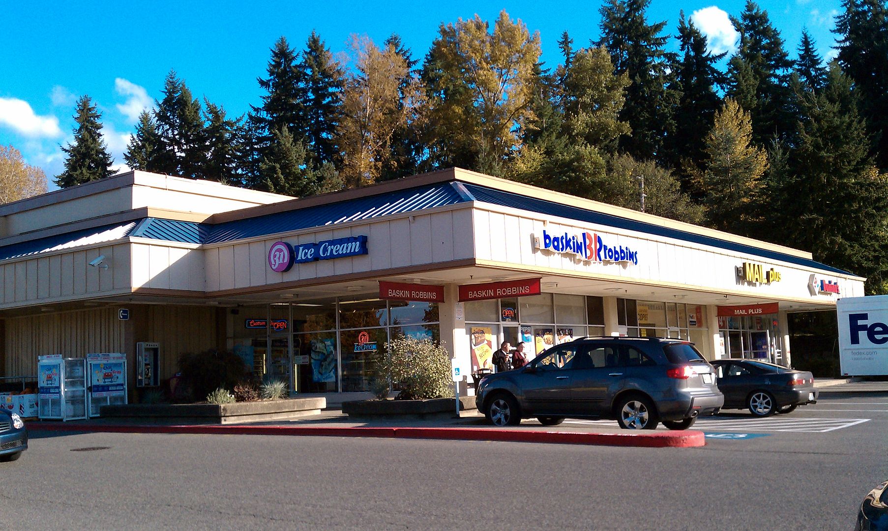
It occurs to me as I see some of the Baskin Robbins locations around here that a lot of these have been there for a very long time. Sometime around the mid Eighties or so, BR changed their logo from the old "Ragtime" logo to the more contemporary (for the time anyway) version that seems to remain on most exterior signs in spite of another logo redesign a few years ago. Back when the original logo change was made, many of the BR stores replaced the old signs with new translites, but retained the old sign frames, leaving the outlines of the older style "BASKIN ROBBINS ICE CREAM" words intact. At least around here, these signs remain in use over 20 years later.
Here is a good example of one of these found locally, but there are several others around here as well. My questions would be these:
-How common are these signs?
-When exactly did the logo change take place?
-As noted above, BR shops here seem to be rather slow to adopt the newer BR logo, at least in their exterior signage. Is this common?
Baskin Robbins signs
Moderator: Groceteria
-
Brian Lutz

- Veteran
- Posts: 227
- Joined: 08 Jul 2008 00:19
- Location: Bellevue, WA
- Contact:
Baskin Robbins signs
The Sledgehammer - Version 2.0 - Seattle Area Malls, Retail History, and other random things.
Re: Baskin Robbins signs
I have seen a few which still retain the old sign frames you describe, but the "Baskin-Robbins" portion on some has been completely removed from the building. I haven't seen the new signage anywhere around here. In fact, I haven't seen a new-build, standalone Baskin Robbins in years. It seems like most of the standalone units were likely built in the late 70s or at the latest early 80s.
Re: Baskin Robbins signs
Now that you bring that up: I have not seen a 'new' BR in many years with the possible exception of the Bullhead City, Az store. It has a late 1990's vibe.Super S wrote:I have seen a few which still retain the old sign frames you describe, but the "Baskin-Robbins" portion on some has been completely removed from the building. I haven't seen the new signage anywhere around here. In fact, I haven't seen a new-build, standalone Baskin Robbins in years. It seems like most of the standalone units were likely built in the late 70s or at the latest early 80s.
Bearhawke in Arizona
Re: Baskin Robbins signs
I have seen new Baskin Robbins locations, however, they are not standalone units. They are located in strip malls, enclosed malls, or as one of the outside shops in a newer Fred Meyer store building.Bearhawke wrote:Now that you bring that up: I have not seen a 'new' BR in many years with the possible exception of the Bullhead City, Az store. It has a late 1990's vibe.
-
Brian Lutz
- Veteran
- Posts: 227
- Joined: 08 Jul 2008 00:19
- Location: Bellevue, WA
- Contact:
Re: Baskin Robbins signs
And here's a particularly odd example of one of the local shops in the area: The sign on the front of the store has been replaced with the current logo, but the older sign (one of the aforementioned examples of the newer translites being put into the older sign frames) on the other side of the storefront remains, thus representing (indirectly at least) all three generations of the Baskin Robbins logo at the same time.
The Sledgehammer - Version 2.0 - Seattle Area Malls, Retail History, and other random things.
Re: Baskin Robbins signs
My favorite BR logo was the one using 'old US cowboy west' style block letters. That went out, what, 25 years ago?
http://www.baskinrobbins.com/About/OurHistory.aspx
Scroll down towards the bottom of BR's history page. :)
http://www.baskinrobbins.com/About/OurHistory.aspx
Scroll down towards the bottom of BR's history page. :)
Bearhawke in Arizona
-
submariner

- Veteran
- Posts: 258
- Joined: 01 Jul 2007 02:13
- Location: Orange County, CA
Re: Baskin Robbins signs
The "circus" logo was designed in 1959 and was BR's longest-standing logo.Bearhawke wrote:My favorite BR logo was the one using 'old US cowboy west' style block letters. That went out, what, 25 years ago?
http://www.baskinrobbins.com/About/OurHistory.aspx
Scroll down towards the bottom of BR's history page. :)
I want to say the italicized logo used prior to the current one was introduced in the early-mid 90s. It's hard to find info on that switch for some reason.
The current logo was introduced in 2007.
==========
Aaron
"his foxtail-wielding skills are unparalleled, dust bunnies fear his name"
Aaron
"his foxtail-wielding skills are unparalleled, dust bunnies fear his name"
-
Brian Lutz
- Veteran
- Posts: 227
- Joined: 08 Jul 2008 00:19
- Location: Bellevue, WA
- Contact:
Re: Baskin Robbins signs
I'm thinking that the logo was introduced in the late Eighties, although it probably took some time to make the switch over (they don't seem to hurry much with sign changes, as you can see here.)
The Sledgehammer - Version 2.0 - Seattle Area Malls, Retail History, and other random things.
-
TenPoundHammer
- Veteran
- Posts: 225
- Joined: 17 Jan 2007 21:05
Re: Baskin Robbins signs
The one in Bay City, MI still had the first-generation sign until a few years ago; only the post is still there. The building still hasn't been updated with the 2007 logo:
http://maps.google.com/maps?f=q&source= ... 41,,0,1.51
Most modern BR openings have been 2-in-1s with Dunkin' Donuts. Bay City got one of those in a rebuilt Shell station a few years ago (it previously had just a Dunkin' Donuts) but for some reason, the station closed about a year later.
It seems the chain hasn't been in the best of shape. I know they closed a bunch of smaller-market locations (Owosso, Alpena, Lapeer, Traverse City and Niles to name a few) and all but exited Flint and Detroit in the 1980s. The last two in Lansing closed this past year, and I think they're down to just one in Grand Rapids (a Dunkin' Donuts combo). Even some of the 2-in-1s have closed.
Re: Baskin Robbins signs
Whenever I think of Baskin Robbins: that 'circus' logo is what comes to mind; the present one is downright repulsive in my eyes.submariner wrote:The "circus" logo was designed in 1959 and was BR's longest-standing logo.Bearhawke wrote:My favorite BR logo was the one using 'old US cowboy west' style block letters. That went out, what, 25 years ago?
http://www.baskinrobbins.com/About/OurHistory.aspx
Scroll down towards the bottom of BR's history page. :)
I want to say the italicized logo used prior to the current one was introduced in the early-mid 90s. It's hard to find info on that switch for some reason.
The current logo was introduced in 2007.
Bearhawke in Arizona
-
StoreLiker2006
- Veteran
- Posts: 209
- Joined: 20 Nov 2006 18:59
- Location: Oak Grove, Oregon
- Contact:
Re: Baskin Robbins signs
http://www.youtube.com/watch?v=2ie7qXmthME
If it means anything to you here, this 1991 commercial shows the '70s style logo on the packaging, but has the newer logo (which lasted until 2006) at the very end of the clip. I also discovered that the trademark had been filed for the newer logo that year as well.
I wonder if they reversed the color scheme of the original 1959 logo sometime in the 1970s?
~Ben